Leonardt Hiro 700 nib

Posted on

I’ve been extremely remiss in not getting a post like this up before now. I blame (prize for originality) being tired and being busy. I’ve got a few things on my plate and, well, a good analogy is that I’ve been eating like a toddler. This post is one of those dried-up peas you find in the corner behind the wine rack, when you go to do a really good vacuuming.  (Aside: Why did we buy a wine rack? Will there be a day again when this object has a use?)

Actually, my analogy doesn’t work at all. Let’s make that a fresh pea that rolled under the edge of the plate and I’m a pretty hungry toddler that eventually finds the pea and eats it. Or something. Maybe it should be a piece of mango. Anyway.

In my previous post about nibs, I mentioned that I’d ordered a Leonardt Hiro 700 nib but that it had arrived damaged so I couldn’t try it out. I fired off an email to Scribblers.co.uk, from whom I’d bought my nibs, and very soon they’d graciously sent me a replacement 700. Not very graciously, I didn’t get around to testing it for a while.

Leonardt Hiro 700 nib

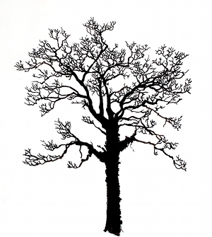
As you can see in this picture, I did eventually get around to testing it, then didn’t clean it that well. It’s a smooth, shiny, springy little object and I really wanted to like it.

As it happens, I really did like it. Testing it against a Gillott 303, I found the Leonardt 700 smoother and more controlled, with less risk of making puddles by dragging ink from previously-drawn thick lines (perhaps because it doesn’t put down as much ink at once? This attribute is probably quite dependent on the consistency of the ink, too).  Looking back at my other post, I should have played with the Gillott 170 at the same time to get a comparison. The Leonardt 700 can’t get down to the hairline that the Gillott 303 makes, and doesn’t seem to have the same dynamic range as either the Gillott 303 or the Gillott 170, but it is very flexible and friendly to use. If I find I’m using it a lot, I will have to get a supply of them, because I don’t think these will last like the giant, stiff Hunt 513 EF that I’ve had for well over a decade.

Another note: Nick Mullins of nijomu.com, who uses nib pens a lot more than I do, has some much more professional-looking nib tests here and here, with more nib photos and discussion here.  Nick noticed my post and linked over here.

Many thanks to Simon of Scribblers for the new nib.

Pear trunk

Posted on

“Recently” is a word I use a lot. It has a temporal vagueness that’s irresistible to my under-rested brain. Anyway, “recently,” G pointed at the stem on a pear and called it the “trunk.” I thought that was funny and made plans to draw how that might work.

I made little sketches and thought about how to keep it simple. I tried inking a couple with nib pens. I decided I was working too small for comfort and scaled up to one of my practice-wash pages from the tree and moon drawing. For the larger, textured paper, I felt that brushes would suit the simple lines better than nibs. My ink brushes are a motley bunch, heavily used in the past; clearly a long holiday hasn’t let them grow back the ability to form a point! So I had scaled up my scale problem, but the brushes did glide smoothly over the paper.

In keeping with my original vision (“I see…I see a pear, growing out of the ground!“), I made everything nice and simple. Thanks to my preliminary drawings, I knew more or less how I wanted to accomplish that.

Ink over leftover wash

There’s not that much to see in the first picture; I just wanted to show how awful this rejected sunset wash was (remember, I was trying to make it smooth). Next was to give the pear and grass some bulk of their own.

Coloured pear trunk

The shadows under the pear really aren’t finished, after one watercolour session. It’s possible I’ll improve it sometime.

I’m quite hoping for some more inspiration from G for my next drawing.

Rookie mistakes

Posted on

A few weeks ago, riding home at twilight, I was inspired by the silhouettes of bare trees, with a crescent moon falling through the top of the treeline. The sky was still pink at the horizon, with a really glowing light blue higher up. It looked like a nice basis for a simple ink drawing, with a watercolour wash for the sky. It was to become a bit of a project, due to…well, I’m struggling to find a way to put this that doesn’t mean “my inability to get any of the steps right.”

On another evening ride, I took a large selection of photos along that stretch. I chose a tree that appealed to me, with many, many branch crossings, and a vine running up the trunk, and copied it fairly closely using india ink. This step let me decide the proportions and most of the structure, and isolate the tree from its neighbours. Tidying up so my brain would have a chunk of pre-processed information to deal with when it came to making the tree again “for real.”

I’d passed this strip of trees many times (technically enough to call “thousands”) and not really observed them. Now I paid more attention and saw that the vines are rampant in the wood. Many have been sawn off at the bottom, and these are leafless, allowing me to see how woody and tightly woven about the tree trunks they are. I felt less friendly toward the vines, and decided to leave them out.

Soon after this, I began to make a lot of mistakes.

I prepared a carefully-masked crescent moon on some Frisk CS2 NOT-finish paper (“for superb colour washes”).

Aside: Wikipedia and, perhaps more reliably, handprint.com tell me that NOT is a UK term for cold-pressed (“not hot-pressed”), which until now I’d thought would be a silly thing for it to stand for. Actually, having probed the depths of my soul, I find I still think it’s silly. If it’s capitalized throughout, it should be an acronym (and, in my opinion, all acronyms should be capitalized throughout, but that’s another digression).

I then attempted to wash in the sky as I remembered it. I overworked it spectacularly.

Reasoning that I could still completely screw up the drawing part, I swallowed my disappointment and traced the outer boundary of my first drawing onto the page with pencil, and set about inking with brushes and dip pens.

The damage done by overworking the wash had ramifications for the ink. The edges of my lines feathered, and I had trouble with blobbing. Now I had a hilariously-pathetic sky with an even more ludicrous tree. I liked the moon, but there was no denying it was time to start over.

I practiced washes on quarter-sheets (11″ x 15″) of student-grade Fabriano paper, working fast (for me), with the biggest brush I had (not big enough). I think this paper was more robust than the A4 pad I’d used before. I do happen to know that am able to destroy this paper, too, by overworking, so I kept a tight rein on my impulse to “improve.”

I selected one of the three or four pages to continue the exercise on, and was fairly far into the inking when I noticed some dirty-looking smudges of unknown origin on the page (my doing? the toddler’s doing?) and this was the last straw.

I worked a little more on twigs, but abandoned the ground. I did feel I owed the thing a moon. I drew it in pencil, then filled it in with gouache. I knew I was being careless with the moon’s placement when I did it, but in retrospect I regret it.

Trying to erase the pencil lines removed not only most of the gouache, but also some of the pigment in the sky. I also attempted to remove some smudging; this gave me yet more unevenness in the sky.

You may notice that, having “decided” the proportions of the tree in the original drawing, I let the trunk grow longer. I don’t think this was to its benefit. There are some more niggling issues with the tree, which I would adjust in any future revisions.

I think I’ve almost finished the preparations for this drawing. Maybe in a year or so I’ll have the stomach to look at it again!