Photo editing with the GIMP: Rounded corners Part I

Posted on

roundedsquarebutterfly

Edit: This is not the first way I should have described, because it’s not the easiest way.  See Part II for the really, really easy way.  See Part III for using layer masks to do the same thing, but only if you’re interested in learning about layer masks, because rounded corners are incredibly fast and easy in the GIMP using the Round Corners filter.

Edit again, Dec 6 2009: I have also done a demonstration of one way to make only one, two, or three corners round, in “GIMP: Combining selections.”  In it, I used this method to make a rounded selection, and then I added the desired square corners to the selection.

If I insist that the GIMP is a good tool for manipulating digital photos, I should show it doing something, shouldn’t I?  Since I was recently interested in trying this, let’s do rounded corners. You may want to do this for effect on a photo, or maybe you’d like to make some round-edged web graphics.  There’s more than one way to accomplish the same effect, as is so often the case.  I’ll look at one method (“Rounded Rectangle”) with a couple of variations here, first in a long-winded fashion and then at the end, in point form.

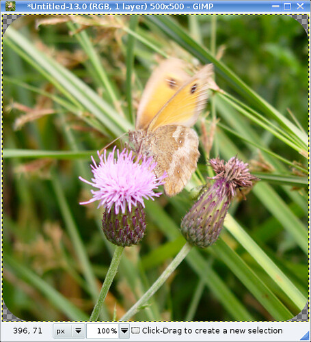
Here’s a picture from my little butterfly-photographing spree this past summer.  I’ll go through how to make corners round on that.

squarebutterfly

As I learned back then, this butterfly is called a Gatekeeper.  It’s a little blurry.  Decided to flap its wings just as I wanted to take a picture.  Let’s not worry too much about that.  It won’t affect the corners, right?  Actually I kind of like the effect.

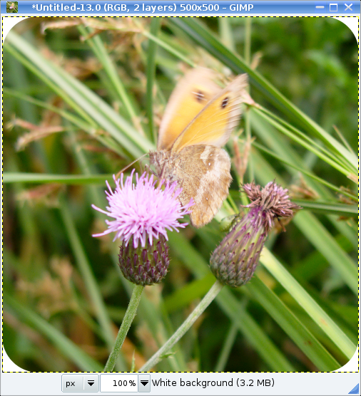
Here’s a screenshot of the image open in the GIMP.  I’m using it under Linux with KDE 4, but it runs under Windows and OSX, too.  It’s free.  I have my toolbox and tabs with settings and stuff over on the right, and the image gets its own window.  The layout is pretty configurable.  Everything that has a tab can have its own window, for example, so you can see it all at once (if you have the screen real estate).

shot01

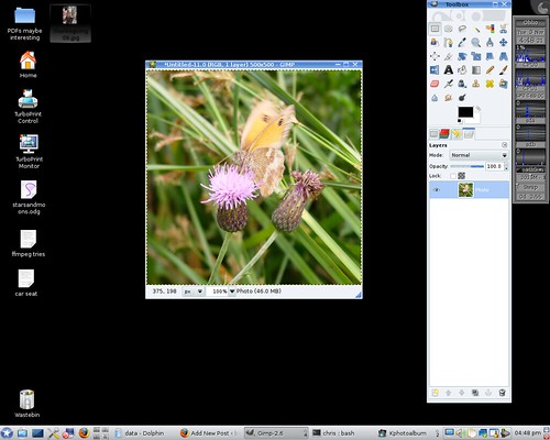
Here’s a good place to demonstrate the right-click menu in the GIMP.  You can set your preferences so that there’s a menu bar along the top of the image window, but all the same options can be found by right-clicking anywhere on the image.  This brings up the main menu, and has the advantage that I don’t have to move my mouse up to the top of the window before clicking.  Just click with the right button wherever you are (as long as it’s on top of the image somewhere) and slide down to the menu item you want.  I find this a more natural movement and faster than using a menubar.

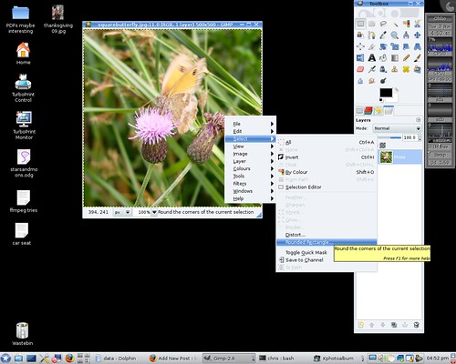
I should get down to the corner-rounding, shouldn’t I?  OK.  While I’ve got the menu open, I’ll choose Select -> Rounded rectangle.

shot02

This window pops up, asking how sharp the corners should be:

shot03

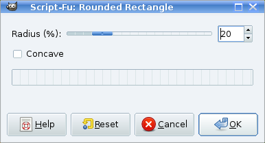
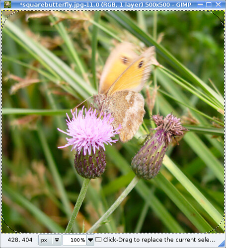
I choose 20%, and here’s what it gives me.  There are now round corners delineated by dotted lines (“marching ants”):

shot04

From what I can tell, “radius” and “percent” in the Rounded Rectangle dialog box actually mean “diameter of the circle segment used to make the corner” and “percentage of the length of the shorter side of the photo.” So if you have a square photo and set the “radius” to 100%, this makes the selection the biggest circle that will fit inside your image.  So 20% means that if you visualize a whole circle starting in the round corner, that circle is 1/5 the height of the photo.

The situation at this point is that we have an area of the photo selected that has corners shaved off of it.

You need to decide whether you want the corners to be transparent or not.  If you are saving as a jpeg without transparency, then you may want them to be white (or another colour) to blend in with a background.

If transparent, I think the easiest thing to do is hit Ctrl-C to copy that selection, and then Ctrl-Shift-V to paste it as a new image (or with the mouse, right-click anywhere on the image and select Edit -> Copy, then Edit -> Paste as -> New Image).  Then you get this:

shot05

At the corners you see a checkerboard pattern: that’s like the table the photo is sitting on. You can see it through the transparent pixels in the corners. Save your image in a format that preserves transparency, and you’re done.

If you want opaque corners, there are two easy ways I can think of.  Let’s assume you want them to be white.

Way one: Paint in the corners. With the ants still marching around the rounded corners, right-click on the image to get the menu out, and choose Select->Invert, which makes everything that was selected unselected, and vice versa.  So now just the corners are selected.  Use the bucket tool to fill all the corners with the colour you want.  Ta-daa!  Done.

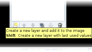
Way two: Put a white layer below the photo. Take the image above, with the transparent corners, and add a layer to it, filled with white.  There’s a button to create a new layer at the bottom left of the layers tab (at the very bottom of the “Toolbox” window, in my case):

shot06c

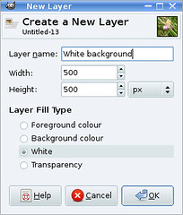
A window pops up asking for some details about the new layer I want to create.  You can give your layers names.  I’ll call this one “White background.” I’ve got the radio button ticked for a layer pre-filled with white.  By default it’ll make the layer the same size as the photo layer.

shot07

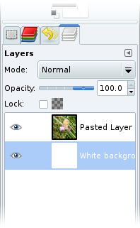
The new layer will appear above the one that was there before.  I only want to see white where my photo layer is transparent (i.e. the corners) so I click on the White background layer in the Layers tab and pull it down so it’s at the bottom of the stack as below.  (Yes, the stack of two layers.  I couldn’t think of a less grandiose word.)

shot08c

The photo window now looks like this:

shot09

Done.  Save in any format you need.  If your format doesn’t support multiple layers, the GIMP will ask if you want to “export” the file as a flattened image, which is what you want to do.  And if you put the picture into a blog post:

roundedsquarebutterfly

Ta-daa.  A roundy-cornered photo.

To sum up:

1. Open your image

2. Choose Select -> Rounded rectangle.

3. Choose how sharp the corners should be.

Now, if you want transparent corners:

4. Hit Ctrl-C to copy that selection, and then Ctrl-Shift-V to paste it as a new image.

5. Save in a format that supports transparent pixels.  Done.

Or, if you want white corners, either:

4. Choose Select -> Invert so the corners are selected.

5. Fill in the corners with white using the paint bucket tool.

6. Save.  Done.

or (white corners method 2):

4. Hit Ctrl-C to copy that selection, and then Ctrl-Shift-V to paste it as a new image.

5. Create a new layer filled with white.

6. Put that layer below the photo layer.

7. Save (or export).  Done.

Believe it or not, I’m not done writing about round corners yet.  I’ll write another post on a different approach to rounding the corners that adds a layer of complexity, but also adds flexibility to expand your ambitions far, far beyond simply shaving off corners.

Update Nov 6: Here’s what the official documentation at Gimp.org says about this method of rounding corners:

Select -> Rounded Rectangle

…well, a lot of parts of the GIMP Manual are more detailed than that.  It’s worth checking out when you want to understand a feature.

“Select -> Rounded Rectangle

My submission to the Pioneer Woman’s “rounded corners” photo assignment

Posted on

Something neat has popped up over at The Pioneer Woman‘s Photography pages: lately a series of photography “assignments” have featured there.  PW (or in the case of the first assignment I saw, Miz Booshay) sets some sort of criterion for the photos (subject matter or technique) and people, lots of people, post photos, new or old, into a Flickr pool.   PW has been trawling through this pool and posting a pile of her favourites.  How she manages this with the homeschooling and preparing for a book tour, I’ll just not even try to fathom.  The assignments are simple and the deadline is tight, which makes it quick and easy to participate.  I signed up to Flickr just so I could join in (having refrained up until then mostly because I disagree with Yahoo insisting on knowing my birth date).

Since I am monumentally outclassed in the Assignments pool, and nobody will ever see my submissions there, I thought I’d better just put up my own submission from the Rounded Corners assignment here in my own space where loads of people will see it.  Har har.

I do all of my photo processing in the GIMP, about which I’m thinking of writing more, because people seem to think you need a copy (legitimate or otherwise) of Photoshop to do photo manipulation, and actually the GIMP (free and open-source) is really usable for things normal people routinely would like to do.

For the Rounded Corners assignment, which consisted essentially of submitting a photo with rounded corners (!), I zipped through my photo database (I use Kphotoalbum, being a Linux/KDE user at home) and grabbed a shot of G making a baby-beeline for one of the apples under the tree in our garden this summer.  I had snapped this one quickly before heading her off, to avoid the contact with gross snails and grosser earwigs that I’ve learned goes with turning over fallen apples. Here’s the “normal” version, cropped, with some colour boosting and probably some sharpening in the GIMP:

One thing you’ll notice right away is that the baby is overexposed.  The exposure was 1/1250 s long, which is not as short as the 1/2000 my Canon A700 will go to (or at least that’s what I can get in shutter-priority mode; I assume that in program mode it put the smallest aperture available, and I don’t know what the shortest possible exposure is at that aperture setting).  That suggests I didn’t use the right metering mode, or maybe didn’t take care to put the subject in the centre when the camera was doing its focusing and metering magic.  The other problem I would have run into, no matter what I’d done about metering, was that the camera was set to ISO 400.  I take a lot of photos indoors and usually hate the results with the flash on my camera, so a high ISO is the norm for me.  On a sunny day, taking a picture of a subject in a white bodysuit, this wouldn’t have been a wise choice of sensitivity.

In any case, the “glow” from the overexposure did remind me of shots from the era when I was small, and so do rounded corners, so I thought I’d go for a 1970s look.  I did a quick search on the properties of older snapshots and found mention of blurring (no kidding, plenty of blurry photos in any era), as well as fading of the magenta component, resulting in a bluish tinge.  This is where Wikipedia would insert “[citation needed].”  I didn’t find the source again when I searched just now.  I tried biasing the colour toward cyan at first, but ended up with a cold look that didn’t feel right to me.  I have a distinct image in my mind of at least one faded photo of my parents that had turned warmer in colour.  Maybe different processes aged differently.  I don’t know.  Anyway, I decided to go with the warmer look.

This was compatible with a filter available in the GIMP, appropriately called “Old Photo,” which will take an image and do any or all of the following to it: defocus, fade the border to a distance you specify, turn the colour to sepia, and add a fine mottled texture.  The result is meant to look like a really old photo – a sepia print.  I didn’t want this, but if I applied “Old Photo” to a duplicate layer and then twiddled the opacity, it added some warmth that I liked.  I also liked the faded edge, but this effect was clipped at the corners by rounding them, so I decided to do the fading separately.   I selected “sepia” and “defocus,” leaving out the mottling.

As usual I ended up with a stack of tweaked layers with colour adjustments, blurring, fading, etc., and finally I merged the visible layers to output a JPEG to upload to Flickr:

I think I did a decent job of emulating a time-faded personal snapshot from the 1970s; in that sense I’m satisfied with the result.  Aesthetically and artistically I found it a bit underwhelming, but that doesn’t concern me too much.  The original snapshot makes me smile, and it was fun fiddling with ways to modify it.

Vagaries of horizontal lines in Openoffice.org Writer

Posted on

I recently had occasion to put horizontal lines into an OpenOffice.org Writer document.  I discovered a couple of surprises.

What I wished to do was insert a simple horizontal line across a page under a heading.  As is my habit, I rummaged around in the menus looking  for the feature I wanted.  There is, indeed, something called “Horizontal Ruler…” in the Insert menu.  Sounds good.

grab1

The first surprise lay here.  The selection of available “rulers” that this option brings up is quite stunning.  It’s a gallery of graphical horizontal rules straight out of 1990s websites.  I’m pretty sure I had something like it on my first webpage in 1997.  I’m talking flashy.  And GIF-y.  I have to concede, in the name of balanced reporting, that none of them had animated reflections or flaming torches at either end (and I must say, in my defence, that neither did anything on my 1997 webpage).  Keeping to the task at hand, though: at the very top is a dotted outline with the word “Plain” inside.

grab2

I went for “Plain.”  This inserts a grey double line.  I had envisioned a single black line, but I was trying to finish something before bed, so I decided not to worry too much.  Relative to the other options, it was pretty dignified:

Screenshot of "plain horizontal ruler" in Openoffice.org writer

The behaviour of this double line was a bit baffling though.  I didn’t seem to be able to select it by clicking on it.  I couldn’t figure out how to get rid of it.  Soon, I had had it with this “horizontal ruler” and I started searching for another way to insert a line.  I did find one, in a sense, but more on that later.  Luckily I eventually came across my second surprise on the OpenOffice.org users’ mailing list, which made some sense of the situation: the plain horizontal ruler is a paragraph with a bottom border.

Another screenshot of a horizontal rule in oowriter

That’s right: you can’t grab it but you can type into it if you want.  Understanding that you’re working with a paragraph is the key to accomplishing anything with this line.  Under Format -> Paragraph (or by right-clicking on the line and choosing Paragraph), you can change the style, make it a single line, change the colour, put a border on any or all of the remaining three edges of the paragraph, adjust the width or the spacing above or below, or whatever.  And to get rid of it is really easy.  Put the text cursor on the first character of the line and hit backspace.  Another method, if you have the formatting toolbar showing: with the cursor sitting on the line, select “Clear formatting.”  If the Formatting toolbar isn’t showing you can do F11 or select Format -> Styles and Formatting  and double-click on “Default.”

So stepping back one step, I was looking for another way to put in a horizontal line.  I came across a shortcut on http://www.ooowiki.de/HelpOnRules, which I think is actually meant to be instructions for editing the wiki it’s on, but I didn’t realize it at the time and tried it out on Writer.  Some of it works!  Three hyphens, three equals signs, or three underscores in a row followed by a carriage return give instant lines of different styles.  Incidentally, three plus signs give you a one-row, two-column table.

Horizontal-rule shortcuts in OpenOffice.org Writer

This is really neat.  Now I can insert single or double horizontal rules into my documents without touching my mouse.

Too bad I really hardly ever need to do that.

I was disappointed at first to discover that these rules are paragraphs too.  As time goes on, though, I relate less and less to my initial negative reaction toward this method of incorporating lines into a document.  I guess it was to do with the fact that manipulating it was nonintuitive.  It is really very frustrating if you’re hitting the <Enter> key to make some space above the rule and you’re getting more and more ruled lines instead.   Oddly, the “Plain Horizontal Rule” doesn’t do this; only the ones I made using the shortcuts.  I haven’t figured out why.

Stepping sideways, you could also just draw your line using the line tool in the “Drawing” toolbar.

Stepping back more than one step, what about those graphical rulers?  They do not behave like paragraphs.  They’re graphics.  And because (apparently) you can add your own graphics to the gallery, the graphical method is not as ludicrous as I first found it.  I can imagine maybe using it for something tasteful: a nice literary-looking line with a fancy swirl in the middle to end a section or a paragraph of some really classy piece of writing.  Or to add the appearance of class to some really crappy piece of writing.

flourish