This is one of those blog posts. I have purchased something. I have taken photographs of it. I have written some of the things I think about it. Regular readers (Hi Mom!) may or may not find the topic to be of interest. But there are lots of photos! Maybe boring ones! I do get a few one-off hits from Google searches, though, and somebody who is interested may stumble on this someday.
I like to draw with a dip pen, or brush, and india ink. It’s not a particularly portable medium, and there are really good, portable brush pens and pens (the Edding website is so “featureful” that I can’t tell whether the 1800 is on there or not; I chose to link instead to a retailer I’ve used and been happy with, but these pens are widely available) using permanent black pigment ink. But there’s a special magic to crisp india ink sitting at the surface of the page, becoming part of its texture, so if I’m trying to make something “finished,” I prefer this method.
I just purchased a load of new nibs, because I was trying to draw something with my old nibs the other day and couldn’t get the line as fine as I would have liked. I ordered a couple of quite fine nibs, but it’s hard to resist trying a few more when you know you’re paying for shipping (oops, I shouldn’t let on that I seriously consider buying more when shipping isn’t free — I’m more likely to make the purchase in the first place if it is, but if there’s something I really want, there’s an urge to bulk up the order a bit to make the shipping seem “better value.” D’oh!).
I’m going to show off my new nibs here, and share some first impressions. There are some things to keep in mind. One, all I’ve done is to briefly try a whole bunch of nibs in a row. The order of testing will surely have affected my impressions. Two, all nibs of one model are not identical. I bought one of each for testing, but I take the risk of generalizing unfairly if I happen to have a lemon, or if one is damaged. Three, some nibs evolve with use. Four, some nibs have preferences for papers and inks. More rambling about inks and papers at the end of this post.
For the moment, let’s just look at my new nibs!
Gillott nibs, which I’ve never used before:

Left to right: 1290 (“drawing pen”); 170; 303 (“extra fine”); 404. Each manufacturer seems to have its own aesthetic sense. Gillott’s is blue. A corrosion-resistant film?
I made some squiggles with Sennelier India Ink on Fabriano student watercolour paper:

Don’t mind the smudges at the top there. I’m left-handed. My ability to forget the practical consequences of this is one of the reasons I would struggle with calligraphy.
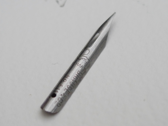
The 303 clearly manages the finest line, and also has a large range of line widths. It’s a little bit fragile on account of its sharpness and flexibility, but just from playing for a couple of days, this nib is really growing on me. The 404 and the 170 are also nice. The 404 is quite robust, a nib you could sketch with and not worry too much about hurting it.
The 1290…if you look carefully in the photo, through the blurriness you can just make out that the end is crimped upward. After making my sample squiggles with this one, I concluded that it wasn’t supposed to be like that. But I believe it actually is. I didn’t get along with this example, on this paper, with this ink. I found it stalled sometimes. It may have a strong preference for smooth paper, or a thinner ink.
Now, Hunt nibs.

Left to right: 22 (“Extra fine”); 101 (“Imperial”); 513 EF (“Globe bowl pointed”); 104 (“Finest drawing”).
I already had one of each of these, except the 101. Aside from a single Esterbrook 048 Falcon (which I was unaware had acquired the status of “vintage” since I purchased mine new), Hunt nibs comprise my entire prior experience of dip pen nibs.


The 22 is reasonably fine. I find it a bit sharp and snaggy, but it’s pretty versatile.
I couldn’t at first figure out what I’d use the 101 “Imperial” for, but after playing a bit, I think I was heavy-handed (what, me?) and it would be quite dynamic in a loose style, with a light touch, possibly on smooth paper.
The 513 EF “Globe” nib is a sort of worry-free, reliable nib, but that means it’s pretty stiff and uniform.
The Hunt 104 is the only nib I purchased that rivals the Gillott 303 for fine-line capability. With its sharp stubby end, I’ve always found it a bit snaggy and frustrating to use, and my first impression with this ink/paper combination was that I much prefer the Gillott 303. However, I found it happier on smooth Bristol paper and less prone to stalling with possibly-thinner Speedball ink. Under these conditions its stiffness made it quite zippy and resilient to a less-than-subtle touch.
Next up: Leonardt.

Left to right: Leonardt 801 (“mapping”), 256, 33, 700 (“Hiro”), and General.
I made a mistake in buying the 801, as I think it might fit in my crow-quill holder but I have no idea where that is at the moment. It does fit over a thin paintbrush but the brush bristles do tend to affect things! The 700 arrived damaged, and doesn’t work. (Edit: I contacted Simon at Scribblers.co.uk and he sent along another 700 pronto. I tried it, and liked it.)

Of the ones I could test, all seemed nice enough, each with its own personality, I didn’t develop very strong opinions about them.
I bought one solitary Brause nib.
Brause number 511B.

I didn’t like it. I pretty much couldn’t get it to work. I’ll have to try it again under some different conditions. I had so much trouble getting the Sennelier ink to flow from this one that I suspect this nib may need a more thorough cleaning than the others to prime it for use. Either that or it just didn’t like my style. It sure is nice to look at, though.
Chances are, if I order more nibs, I’ll check out some more Brause ones next time.
More on papers: I used Fabriano 280gsm NOT surfaced student-grade watercolour paper for this test, and didn’t realize how lucky I’d been. When I tested The Langton Extra Smooth hot pressed paper (for “botanical or fine detail watercolour”), the ink bled, or feathered, quite badly. Daler Rowney Heavy Weight cartridge paper (220gsm) was a bit bleedy, and Frisk CS2 NOT (apparently now extinct) and 220gsm Goldline Bristol were quite good. The Bristol is smooth and much less absorbent, and the Frisk NOT has a bit of tooth but not nearly as much texture as the Fabriano NOT. Unsurprisingly, the more fragile and sharper nibs seem happier gliding around on smoother paper.
More on inks: I used a new bottle of Sennelier India Ink for the examples here. Playing a bit with my old Speedball Super Black, I find that the nibs that tend to stall with the Sennelier ink are less fussy with the Speedball. On paper that’s a bit borderline (e.g. Daler Rowney cartridge), the Speedball ink bled more than the Sennelier, and where the paper wasn’t conducive to bleeding, I imagined the line from a given nib to be a little finer with Sennelier ink. I guess the Speedball is thinner, despite my having had the bottle for years (not that it’s been open a whole lot of that time). Both inks look nice and black to me. If bleeding isn’t going to be a problem, I have an inclination to stick with Speedball because it flows a bit more easily from the finer nibs. I haven’t checked the waterproofness of the inks yet, though, which will be important for line and wash if the wash is going down after the line!