Something neat has popped up over at The Pioneer Woman‘s Photography pages: lately a series of photography “assignments†have featured there. PW (or in the case of the first assignment I saw, Miz Booshay) sets some sort of criterion for the photos (subject matter or technique) and people, lots of people, post photos, new or old, into a Flickr pool.  PW has been trawling through this pool and posting a pile of her favourites. How she manages this with the homeschooling and preparing for a book tour, I’ll just not even try to fathom. The assignments are simple and the deadline is tight, which makes it quick and easy to participate. I signed up to Flickr just so I could join in (having refrained up until then mostly because I disagree with Yahoo insisting on knowing my birth date).
Since I am monumentally outclassed in the Assignments pool, and nobody will ever see my submissions there, I thought I’d better just put up my own submission from the Rounded Corners assignment here in my own space where loads of people will see it. Har har.
I do all of my photo processing in the GIMP, about which I’m thinking of writing more, because people seem to think you need a copy (legitimate or otherwise) of Photoshop to do photo manipulation, and actually the GIMP (free and open-source) is really usable for things normal people routinely would like to do.
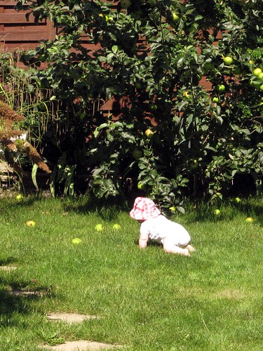
For the Rounded Corners assignment, which consisted essentially of submitting a photo with rounded corners (!), I zipped through my photo database (I use Kphotoalbum, being a Linux/KDE user at home) and grabbed a shot of G making a baby-beeline for one of the apples under the tree in our garden this summer. I had snapped this one quickly before heading her off, to avoid the contact with gross snails and grosser earwigs that I’ve learned goes with turning over fallen apples. Here’s the “normal†version, cropped, with some colour boosting and probably some sharpening in the GIMP:
One thing you’ll notice right away is that the baby is overexposed. The exposure was 1/1250 s long, which is not as short as the 1/2000 my Canon A700 will go to (or at least that’s what I can get in shutter-priority mode; I assume that in program mode it put the smallest aperture available, and I don’t know what the shortest possible exposure is at that aperture setting). That suggests I didn’t use the right metering mode, or maybe didn’t take care to put the subject in the centre when the camera was doing its focusing and metering magic. The other problem I would have run into, no matter what I’d done about metering, was that the camera was set to ISO 400.  I take a lot of photos indoors and usually hate the results with the flash on my camera, so a high ISO is the norm for me. On a sunny day, taking a picture of a subject in a white bodysuit, this wouldn’t have been a wise choice of sensitivity.
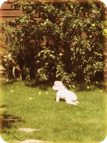
In any case, the “glow†from the overexposure did remind me of shots from the era when I was small, and so do rounded corners, so I thought I’d go for a 1970s look. I did a quick search on the properties of older snapshots and found mention of blurring (no kidding, plenty of blurry photos in any era), as well as fading of the magenta component, resulting in a bluish tinge. This is where Wikipedia would insert “[citation needed].” I didn’t find the source again when I searched just now. I tried biasing the colour toward cyan at first, but ended up with a cold look that didn’t feel right to me.  I have a distinct image in my mind of at least one faded photo of my parents that had turned warmer in colour. Maybe different processes aged differently. I don’t know. Anyway, I decided to go with the warmer look.
This was compatible with a filter available in the GIMP, appropriately called “Old Photo,†which will take an image and do any or all of the following to it: defocus, fade the border to a distance you specify, turn the colour to sepia, and add a fine mottled texture. The result is meant to look like a really old photo – a sepia print. I didn’t want this, but if I applied “Old Photo†to a duplicate layer and then twiddled the opacity, it added some warmth that I liked. I also liked the faded edge, but this effect was clipped at the corners by rounding them, so I decided to do the fading separately.  I selected “sepia†and “defocus,†leaving out the mottling.
As usual I ended up with a stack of tweaked layers with colour adjustments, blurring, fading, etc., and finally I merged the visible layers to output a JPEG to upload to Flickr:
I think I did a decent job of emulating a time-faded personal snapshot from the 1970s; in that sense I’m satisfied with the result. Aesthetically and artistically I found it a bit underwhelming, but that doesn’t concern me too much. The original snapshot makes me smile, and it was fun fiddling with ways to modify it.


